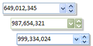
| Set
the display of ctxNEdit as a drop down
control using the built-in drop down and
spinner buttons. |
| |
|
| Objects in
Objects - Incorporate other
objects such as a calculator control for
a combined presentation and added
management capability. ctxNEdit also
supports simple data binding through its
Text property |
| |
|
|
Drop and Spin Buttons - Display optional
drop down and spinner buttons. Add individual
color and styles as required through the
developer defined properties, events and
methods. |
| |
|
| |
|
 |
Modern
Windows UI Design - Style properties allow
developers to set the control for current
Windows styles and themes and for custom
corporate branding standards. |
| |
|
| |
|
|
XML Support - All data, including presentation
detail and style settings, consumed by ctxNEdit
can be imported from or exported to an XML file. |
| |
|
|
Auto-Repeat Clicks - The component supports
the automatic firing of the built-in button
click events. This repeat is based on a
definable repeat rate property available to the
developer. |
| |
|
| |
|
| Defined
Characters - The currency, comma and
decimal characters are all developer defined. |
 |
| |
|
| |
|
 |
Flat
Style - The component can remain flat until
it receives focus or until a mouse-over event. |
| |
|
| |
|
|
Error Trapping - A custom Edit Error event
reports all internal errors when they occur,
including "Large Number" and "Large Decimals"
errors indicating inappropriate entry attempts. |
| |
|
|
Simple Data Binding - For host platforms
that support simple data binding, ctxNEdit
provides a Text property that returns the Value
property of the object as text. The Text
property strips comma or currency characters
from the Value property. |
| |
|
| |
|
| |
|
| |
|
 |