|
|
|
|
|
ActiveX
Controls
for Enterprise
Application Design |
| |
|
|
|
|
|
|
|
|
|
|
|
  |
|
|
|
|
|
|
|
|
Designed for high volume data intensive
applications where performance,
compatibility and functionality are must
have requirements. ctxList 32 is an ideal
Unicode control for reporting and developer
designed data presentations. ctxList
32
offers developers flexible approaches
for managing data from any data
repository. |
|
| |
|
|
| |
|
|
| |
 |
|
| |
|
|
| |
|
|
| |
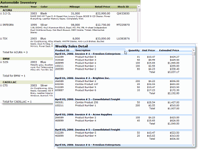
XML Support : All
data, including presentation detail and
style settings, consumed in ctList can
be imported from or exported to an XML
file. XML Styles data is easily consumed
by other supported DBI components
offering developers an economical method
for maintaining presentations. |
|
| |
|
|
| |
Localization :
Full Unicode support |
|
| |
|
|
| |
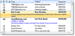
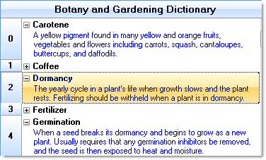
Sub-Text
: Developer-definable multi-line
wrapping sub-text data in addition to
standard row/column list data. |
|
| |
|
|
| |
Sub-Text Nodes : Nodes
(plus/minus boxes) can be assigned to
any list item with sub-text. The user
can then display or hide the sub-text by
clicking on the node. |
|
| |
|
|
| |
|
|
| |
 |
|
| |
  |
|
| |
|
|
| |
 Modern
Windows Styles : The background
of the list, title, headers, and
pre-columns can all be colored with
different fill styles. Modern styles
including patterns for horizontal,
vertical, diagonal, horizontal bump,
vertical bump, pyramid, diamond,
circular and elliptical gradient fills.
Header and list item border and fill
styles properties including Header and
Item over styles and fill types. Modern
Windows Styles : The background
of the list, title, headers, and
pre-columns can all be colored with
different fill styles. Modern styles
including patterns for horizontal,
vertical, diagonal, horizontal bump,
vertical bump, pyramid, diamond,
circular and elliptical gradient fills.
Header and list item border and fill
styles properties including Header and
Item over styles and fill types. |
|
| |
|
|
| |
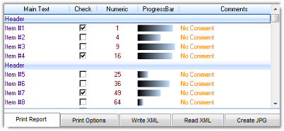
Check Boxes : Give end
users direct select / unselect
capability for discrete data
manipulation. Support for check boxes in
a column. |
|
| |
|
|
| |
Pre-Column : A visible
or non-visible column for identifying a
selected item. Numbers or bitmaps can be
placed in the Pre-Column and alignment
set. |
|
| |
|
|
| |
Built-in Text Search :
Search for a text string in a given
column. Support for soft-seek and case
sensitive searches. |
|
| |
|
|
| |
|
|
| |
 |
|
| |
  |
|
| |
|
|
| |
Print The List : Built
in printing makes it easy to print
reports and data presented in the list.
Support is provided for a wide variety
of paper sizes, custom properties and
events accommodate unconventional paper
sizes. Additional developer controlled
page breaks, footers, page numbers, and
printer handle features offer precision
reporting and printed data
presentations. |
|
| |
|
|
| |
Alternate Line Colors :
Add special row highlighting with
alternating line and background colors. |
|
| |
|
|
| |
Drag and Drop : Full
drag and drop support including items
into and out of ctList. |
|
| |
|
|
| |
Masked Bitmaps : Add image details -
great for inventory presentations, sale
items, Real Estate listings - a picture
is always worth a thousand words... |
|
| |
|
|
| |
Edit Text : In place
text editing for any of the first column
list items. |
|
| |
|
|
|
Grid Lines : Developer
defined horizontal and vertical lines
between the columns and list items. |
|
| |
|
|
| |
 |
|
| |
|
|
| |
  |
|
| |
Multi-Select : Support
for multi-select. |
|
| |
|
|
| |
Internal Image List :
The internal image list can be used to
assign images to cells and column
headers of the list control. |
|
| |
|
|
| |
Column Designer Property Page
: Design all columns through the
controls property pages. |
|
| |
|
|
| |
Header Items : List
items can be set up as headers. Header
will not be broken up by defined
columns. |
|
| |
|
|
| |
Column Data Types :
Columns can be defined as text, numeric,
or date/time providing efficient column
sorting. |
|
| |
|
|
| |
Single and Multi-column Sort
: Sort the list on values contained in
any one, or combination of up to three
columns simultaneously. Sorting can be
based on column data type such as text,
numeric, or dates. |
|
| |
|
|
| |
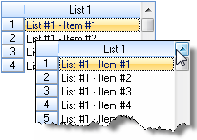
Tool Tips : Support for
tool tips for text within a cell, and
for the vertical scroll bar. |
|
| |
|
|
| |
|
|
|
|
| |
|
|
|
|
| |
|
|
|
|
| |
 |
|
| |
|
|
|
|
| |
 |
|
 |
|
| |
|
|
|
|