|
|
|
|
|
ActiveX
Controls
for Enterprise
Application Design |
| |
|
|
|
|
|
|
|
|
|
|
|
  |
|
|
|
|
|
|
|
|
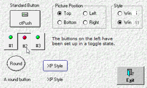
ctPush is an enhanced picture push
button component incorporating all of
the usual features and functions of a
command button. |
|
| |
|
|
| |
ctPush can be implemented with text
and/or an image, assigned to an
accelerator key, given a default state,
cancel state, or toggled state, used
with masked bitmaps, and customized with
multiple bevel sizes. |
|
| |
|
|
| |
|
|
| |
 |
|
| |
|
|
| |
|
|
| |
Pictures and Text :
Place text and/or an image inside the
button. An image can also be used as the
background of the button. |
|
| |
|
|
| |
Modern Windows UI Design Styles
: New style properties allow
developers to set the control for
current Windows presentations regardless
of operating system version. |
|
| |
|
|
| |
Different Image States
: Definable images for up, down, and
disabled states. |
|
| |
|
|
| |
Text Wrap : Support
for text wrap within the button. |
|
| |
|
|
| |
Toggle Buttons : The
buttons can be set up to toggle
(on/off). |
|
| |
|
|
| |
Simulated Transparency
: Provides a transparent background
without requiring the host language to
support transparency through its OLE
container. |
|
| |
|
|
| |
|
|
|
|
| |
|
|
|
|
| |
|
|
|
|
| |
 |
|
| |
|
|
|
|
| |
 |
|
 |
|
| |
|
|
|
|