|
|
|
|
|
ActiveX
Controls
for Enterprise
Application Design |
| |
|
|
|
|
|
|
|
|
|
|
|
  |
|
|
|
|
|
|
|
|
ctxTreeView is a 32-bit navigational hierarchical
tree and data outline control offering
extensive presentation, interaction, and
print functionality ideal for document
management, index entries, file
directory structures and reporting. |
|
| |
|
|
| |
ctxTreeView has been designed for high volume
data environments where performance,
compatibility and functionality are
must-have requirements for enterprise
and commercial software solutions. |
|
| |
|
|
| |
|
|
| |
 |
|
| |
|
|
| |
|
|
| |
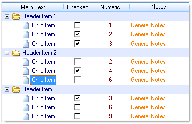
ctxTreeView consists of a series of node
objects. Each node may have its own text
(or label), bitmaps, check boxes and
radio buttons. Each node item in the
list may also have subordinate items or
children. These children are represented
as indented levels. When a parent item
is expanded, its immediate child items
become visible. When the parent item is
collapsed, child items are hidden. |
|
| |
|
|
| |
XML Support : All
data, including presentation detail and
style settings, consumed in ctxTree can
be imported from or exported to an XML
file. XML Styles data is easily
consumed between other supported DBI
components offering developers an
economical method for maintaining
presentations. |
|
| |
|
|
| |
Localization :
Full Unicode support |
|
| |
|
|
| |
Export to Image : Use
the custom export-to-image method to
easily create JPEG image file displaying
the ctxTreeView's contents. |
|
| |
|
|
| |
Current Windows Styles
: The title, header, and main data areas
of ctxTree-32 can all be colored with
individual fill styles including
patterns for horizontal, vertical,
diagonal, horizontal-bump,
vertical-bump, pyramid, diamond,
circular and elliptical gradient fills.
Set header styles and header over styles
including sort arrow types and styles. |
|
| |
|
|
| |
Printing : Built in
printing makes it easy to print reports
and data presented in the TreeView.
Support for a wide variety of paper
sizes, custom properties and events
allow the control to accommodate
unconventional paper sizes. Developer
defined page breaks, footers, page
numbers, and printer handle features
offer precision reporting and data
presentations. |
|
| |
|
|
| |
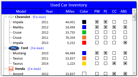
Node Display Features :
ctxTree can display a variety of
different items in a node. With the
actual text for the node, nodes can show
"Plus/Minus" picture, "Open / Close /
Leaf" picture, an independent bitmap
image, and Tree Lines. |
|
| |
|
|
|
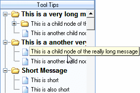
Tool Tips : ctxTree can
display three different types of tool
tips. Line Tips appear when the mouse
moves over the text of a node. Parent
Tips appear when the mouse moves over
the line area of and the parent of that
node is not visible. Scroll Tips appear
when the vertical scroll bar is being
moved. |
|
| |
|
|
| |
 |
|
| |
|
|
| |
Edit Node Text :
ctxTree View's first column can be set to an
edit mode. End-users may enter or edit
node text by selecting it with a
mouse. |
|
| |
|
|
| |
Sub-Text : Each node
item can contain its regular text as
well as sub-text. |
|
| |
|
|
| |
Node Cargo and Node Data
: ctxTree includes non-visible properties
into which text strings (cargo) or
integer (data) may be associated with
specific nodes. This feature is perfect
for storing a records key information.
The Find Data and Find Next methods
provide the ability to locate nodes
according to these hidden data values. |
|
| |
|
|
| |
Virtual Mode : By
default, data added to ctxTree is managed
in global memory. However, if demands on
memory become excessive, ctxTree-32 includes
a virtual mode that queries the host
program for appropriate text for each
node when it is required for display. |
|
| |
|
|
| |
Check Box Support :
Support for check boxes in any cell in
the control. Support for custom (user
supplied) check box images. |
|
| |
|
|
| |
Radio Button Support :
Support for child nodes to be group and
set up with radio buttons (first column
only). Support for custom (user
supplied) radio button images. |
|
| |
|
|
| |
|
|
| |
 |
|
| |
|
|
| |
Multi-Select : Support
for multi-select. |
|
| |
|
|
| |
Internal Image List :
An internal image list can be used to
assign images to cells and column
headers of the list control. |
|
|
|
|
| |
Column Designer Property Page
: Design all columns through the
controls property pages. |
|
| |
|
|
| |
Drag and Drop : Drag
items into and out of the tree. |
|
| |
|
|
| |
Masked Bitmaps :
Support for masked bitmaps. |
|
| |
|
|
| |
Load Directory : The
tree can load the current contents of a
directory directly into itself. |
|
| |
|
|
| |
Column Data Types :
Columns can be defined as text, numeric,
or date/time. This now aids in the
column sorts. |
|
| |
|
|
| |
Header Items : List
items can be set as headers. |
|
| |
|
|
| |
Single and Multi-column Sort
: Sorts the list on values contained in
any one, or combination of up to three
columns simultaneously. Sorts can be
based on column data type (i.e. text,
numeric, or dates) |
|
| |
|
|
| |
|
|
| |
|
|
|
|
| |
|
|
|
|
| |
|
|
|
|
| |
 |
|
| |
|
|
|
|
| |
 |
|
 |
|
| |
|
|
|
|