|
|
|
|
|
ActiveX
Controls
for Enterprise
Application Design |
| |
|
|
|
|
|
|
|
|
|
|
|
  |
|
|
|
|
|
|
|
|
ctxDEdit 32 - is a modern Unicode ActiveX masked
edit control for date/ time entry
presentations. Supporting international
time formats, ctxDEdit 32 provides the
developer with a choice of either a
twelve-hour clock or a twenty-four hour
clock. |
|
| |
|
|
| |
|
|
| |
  |
|
| |
|
|
| |
|
|
| |
In addition, pre-defined date formats
are compatible with all regions of the
world. The ctxDEdit 32 component provides
fully featured date and time masked edit
functionality combined with graphically
diverse presentation styles. |
|
| |
|
|
| |
XML Support : All
data, including presentation detail and
style settings, consumed in ctxDEdit 32 can
be imported from or exported to an XML
file. XML Styles data is easily consumed
by other supported DBI components
offering developers an economical method
for maintaining presentations. |
|
| |
|
|
| |
Masked Edit Definition
: Allows developers to enforce the
presentation and entry format of date or
time values. The component supports a
vast array of options for both numeric
and verbose date/time presentation. |
|
| |
|
|
| |
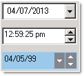
Drop and Spin Buttons: Display
optional drop and/or spin buttons. Their
colors and bevels are defined by the
programmer. |
|
| |
|
|
| |
Auto-Repeat Clicks: The
component supports the automatic firing
of the built-in button click events.
This repeat is based on a definable
repeat rate property available to the
developer. |
|
| |
|
|
| |
Windows Design Styles:
Modern Windows UI design style
properties allow for the latest in user
interface designs, presentations and
styles. |
|
| |
|
|
| |
Intelligent Data Entry
: The component fills in / completes the
entire date when only a part of it has
been entered. |
|
| |
  |
|
| |
 |
|
| |
|
|
| |
Plus / Minus Notation
: Entering + or - and a value when
running the control in numeric format
will increment/decrement the current
value of the control by the number of
days entered. |
|
| |
|
|
| |
Flat Style : The
component can remain flat until it
receives focus or until a mouse-over
event. |
|
| |
|
|
| |
Time Range : A
definable minimum and maximum date/time
range values. |
|
| |
|
|
| |
Cross Year : A
developer-definable cross year used to
automatically interpret short year
values entered by the end-user. |
|
| |
|
|
| |
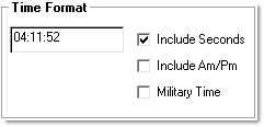
Formatting Options :
Date and time formatting options include
include Am/Pm, include seconds, long or
short years, text alignment, verbose
dates, military time, and definable date
and time separation characters. |
|
| |
|
|
| |
Error Trapping : The
component fires an error event when an
attempt is made (by the end-user) to
enter a date or time that is invalid,
too large (based on the
developer-definable maximum value), or
too small (based on the
developer-definable minimum value). |
|
| |
|
|
| |
|
|
|
|
| |
|
|
|
|
| |
|
|
|
|
| |
 |
|
| |
|
|
|
|
| |
 |
|
 |
|
| |
|
|
|
|